You’ve started your job search and need to polish your resume for hiring managers. Once you’ve added all your experience and credentials, the work doesn’t end there. Your resume needs to be impressive, down to the smallest details, such as the font and size! So if you thought you could leave the default font that Microsoft Word suggested, think again!
Resume fonts should be easy to read and attractive enough to make the hiring manager consider you for a position.
In this article, we’ll look through some of the best fonts for your resume, including traditional fonts and the most popular fonts. We’ll also let you know which fonts to avoid!
Best resume fonts
Garamond
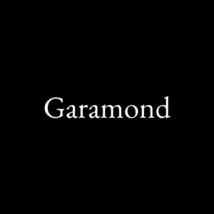
This font is another group of serif typefaces. It is another popular choice for book printing and body texts. This is because it’s great for readability. It subtly offers elegance without offending the reader, making it one of the best fonts for resume writing! Additionally, compared to other resumes using the likes of Times New Roman or Calibri, using Garamond will set your resume apart from others. Used in conjunction with a font like Didot will level you up further!
Constantia
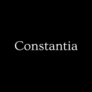
Our next best font for resume is Constantia. It is a modulated wedge-serif typeface and perfect for electronic and paper reading. As a result, it is a good choice for resumes as reading it is effortless. Additionally, as its use case was designed for reading, it’s a no-brainer! Disclaimer: The above image isn’t actually the Constantia font as it is not available for commercial use.
Didot
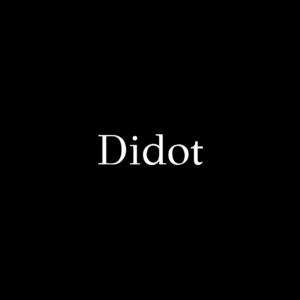
This font is part of a group of typefaces inspired by the Didot family. The font makes section headings look sophisticated and elegant and is certain to make your resume stand out. Specifically, it pairs well with fonts such as Helvetica, Georgia, or Montserrat. However, as the typeface features serifs, they are more prominent in larger sizes, so definitely reserve the use of this font for headings. Instead, use other distinctive fonts to spruce up your resume text.
Gill Sans
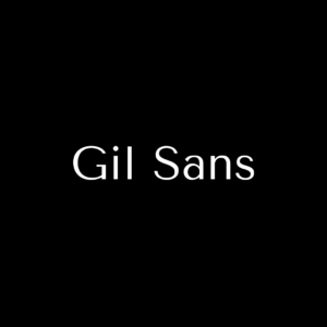
This font is a humanist sans-serif typeface. As an extremely legible and readable font, the professional appeal of this font is clear. Offering a simple yet sophisticated visual design, it is a perfect choice for your resume and is a traditional font. It is used in many corporate settings, including for logos, so using it in your resume will definitely work in your favor.
Helvetica
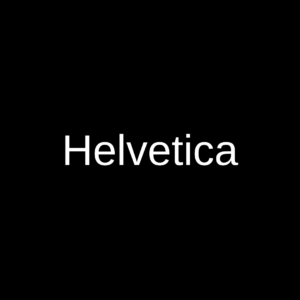
Our next font is another popular sans-serif font. Helvetica is the less-rounded version of Arial but is still one of the classic fonts used. However, due to its clarity and readability, it is widely used professionally. Not just on resumes but also on many mainstream brands’ logos. It’s no wonder as Helvetica is the world’s most popular font. If you wish to make your resume stand out subtly, consider using Helvetica for your body text and pair it with Didot for your headings. Additionally, if you’re looking for a modern sans serif font, consider looking for the new iteration, Helvetica Now which has recently been released.
Due to Helvetica not being one of the default settings but still widely recognized for professionalism, we’ve included it in our best fonts for resume list.
Average resume fonts
Calibri
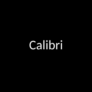
Calibri is the default font used by Microsoft Office programs. It was first introduced in 2007 to be used in conjunction with the ClearType font collection. As a result, it is quite a common font that is used, with most users choosing to keep the font the same. Therefore, if you want to stand out, avoid this one! However, this can be a safe option if you’re spoilt for choice.
Times New Roman
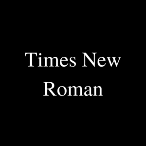
On to another default and so overused font, Times New Roman. This lands in our average fonts for resumes list. This is because it’s another default font set by Microsoft in their products. As a result, many users will forget or dismiss changing the font to something different. If you want a safe option, nothing says that more than Times New Roman. However, if you want to set yourself apart from other job seekers, remove Times New Roman from its entirety on your resume!
Arial
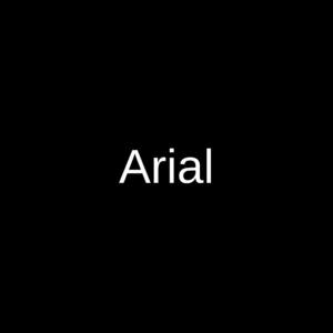
This is another example of an overused font. It is another example of sans serif fonts and is extremely versatile to provide readability while appearing professional. Unfortunately, due to its wide availability, it is overused. Not only is it one of Microsofts’ core fonts, but it is also the default on Google Docs. Therefore, many people choose Arial as their cv font, some without even knowing they have! So, although it is a practical choice, it has to go into average and safe fonts for resumes.
Worst resume fonts
Century Gothic
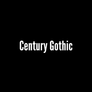
Century Gothic brings a 20th-century design to digital texts. It is quite commonly used for headings in movie posters. However, for body text, especially in resumes and professional contexts, it doesn’t translate as well as other fonts due to tight spacing.
Impact

This font is a sans-serif typeface font. Again it is most commonly used for headings and display text. Therefore, it doesn’t translate well for resumes that require more body text. As a result, this can have a negative impact and makes reading difficult for readers.
Georgia
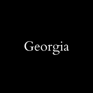
Georgia offers a different alternative to TimesNewRoman. The serif font features larger letters, making reading easy, even in small font sizes. In addition, because it was made specifically for the clarity of graphical devices, the PDF version will look excellent in any document. Wikipedia. Wikimedia Commons/Geared Bull.
Courier

This font is a monospaced slab serif typeface. It was originally designed to be used with IBM’s typewriters. As a result, it’s very old-fashioned and looks quite odd on a screen. It will definitely make your resume stand out but not for the right reasons! It is extremely rare for this font to be used in any professional setting. Unless you’re applying for a typewriter company, you should avoid this font for your resume!
Papyrus
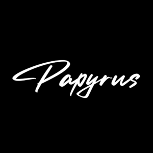
This font is another widely-available font. Due to its unique and distinctive layout, it is not a common choice for resumes. This doesn’t mean that you should use it! In fact, its use is mainly for advertising niche products; therefore, it definitely does not translate well into a professional setting. Avoid at all costs!
Futura

Our next font hails from Germany. Featuring a geometric sans-serif typeface, it is quite appealing. However, it is mainly used for decorative reasons for brands rather than in a professional context. It offers creativity and more personalization but isn’t made for readability. Therefore, when used for a resume, it won’t give off the desired effect.
Comic-Sans
An absolute no-no. Comics-Sans, a sans-serif typeface, was designed with comic-books inspiration. Using this for a resume is probably not a good idea! While it does come with benefits, including being good for those who have dyslexia or ADHD, in a professional context using something more elegant would be a better option.
Does your resume font matter?
While many recruiters and hiring managers may say that it doesn’t matter as much as the content, in short, it does. While the content is definitely the biggest factor in an impressive resume, there are other things to consider. If your resume is polished and you’ve done everything possible to stand out, you’ll feel much more confident in sending it to companies and recruiters. Additionally, your resume will stand out, maybe not literally, but to a recruiter who may have looked at multiple other resumes that are all similar, yours will be the one that looks different. And why? Because it actually does look different!
What font style is most professional?
The world’s most popular font, Helvetica, would be the answer for a professional font style. However, there’s a reason it is used so commonly in corporate settings, and that’s due to its sophisticated yet legible appeal that many other fonts simply do not have.
What is the best font and size for a resume?
While you can play around with different fonts and styles, we offer the following suggestion as the best font for your resume. Didot for headings and Helvetica for body texts. This would combine the best of both worlds with style and elegance. In terms of font size, 11-12pt would be perfect for body text and 14-16pt for headings. However, aim to have your resume only two pages long. You may need to play with sizes to ensure you can achieve this.
Bottom Line
Resume fonts don’t need to be a boring. There are many fonts out there that can add sophistication to your resume. However, in the end, you need to be happy with the final product. In essence, the resume represents you, so you want to ensure that it appears as professional and engaging as possible.
Ready to apply for a new job? Check out the rest of our site for more information about jobs, salary ranges, and other useful insights!

